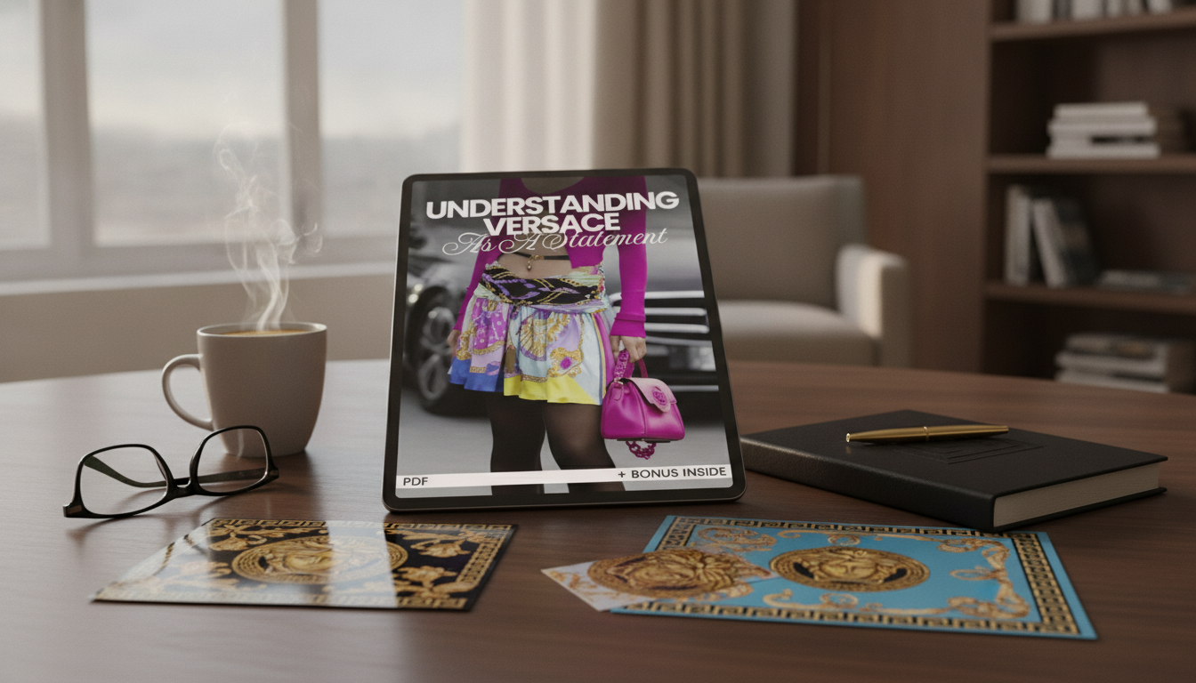
Versace has long stood for visibility—bold silhouettes, unmistakable motifs, and a refusal to blend in. For many buyers, choosing Versace is less about a single item and more about what that choice communicates in social, cultural, and style contexts. The brand’s aesthetic is designed to be read quickly: it signals confidence, taste that leans theatrical, and a comfort with being noticed. For more guidance, see History Of Versace – 1500 Words | Internet Public Library – IPL.org.
Status dressing works when an item communicates “I know what this is, and you probably do too.” Versace is unusually effective at that kind of instant read. For further reading, see Versace – The Brand Story – Luxury Abode.
For background on the house and its origins, Encyclopaedia Britannica’s profile of Gianni Versace offers a useful historical snapshot, while Versace’s official site shows how those codes appear across current collections.
Versace’s motifs act like a vocabulary. Even when the wearer isn’t thinking in “symbols,” the audience often is—especially in style-forward environments.
| Design element | Typical associations | Styling approach that keeps it intentional |
|---|---|---|
| Medusa motif | Power, allure, brand recognition | Let one Medusa detail be the focal point; keep other accessories quiet |
| Greca border | Heritage, structure, “designer” framing | Use as clean edging on an otherwise simple outfit to avoid visual overload |
| Baroque print | Maximalism, drama, flamboyance | Pair with solid neutrals and repeat one accent color for cohesion |
| Gold-toned hardware | Opulence, nightlife energy | Balance shine with matte textures (denim, wool, cotton) |
| Body-conscious silhouettes | Confidence, sensuality, statement presence | Use layering (blazer, coat) to control how bold the look reads |
Fashion is a social language. Versace tends to communicate “intent,” and that intent is often read as status because it implies choice, access, and clarity about identity.
In other words, the “status” read is not only about price. It’s about legibility: others can quickly place the brand, the vibe, and the wearer’s willingness to be seen.
The same Versace piece can read iconic in one setting and mismatched in another. The easiest way to keep it elevated is to align the message with the room.
As a practical rule: the more formal or conservative the environment, the more effective it is to use Versace as an accent rather than a head-to-toe statement.
Versace is designed to be bold, but “bold” doesn’t have to mean chaotic. The difference between costume-like and curated is usually restraint plus precision.
If you want a more structured way to think about Versace—beyond “bold” or “flashy”—the Understanding Versace as a Statement: Why Versace is a Status Choice – eBook Guide breaks the aesthetic into wearable decisions.
For travel and event prep, having reliable power for a phone (tickets, maps, photos, and last-minute outfit coordination) can be part of keeping the whole presentation seamless; the 65W GaN USB C Fast Wall Charger with Quick Charge is an easy add-on for a go-bag.
Versace is widely recognized thanks to consistent brand codes like Medusa, Greca, and baroque prints, and it’s positioned at a luxury price tier that signals exclusivity. Celebrity visibility and a long-standing association with nightlife and pop culture also reinforce the idea that wearing it is a deliberate, high-impact choice.
No. Many Versace pieces can be worn subtly by using a single accent—like a belt, trim, or a monochrome item with discreet detailing—while keeping the rest of the outfit clean and controlled. The brand reads best when the styling is intentional, not crowded.
Choose darker palettes, structured silhouettes, minimal logos, and limit the statement to one item at a time. Small details like understated Greca edging or refined hardware can deliver the designer signal without overpowering the environment.





Leave a comment